The contrast between my books appears sometimes to be confusing. There is a leading thread, however, as each one is the result of a largely visual coup de foudre.
I didn’t plan to go to India, I was invited and once there, it struck me deep. I never thought I would make a book about Holland, but then one day I looked with fresh eyes at the beach I had always known… I had planned to clean out my studio to make space for ‘South India’ and I found all this facinating rust I keep picking up, and now I’m well into the world of steel, and India had to be temporarily shelved. So it is as if I choose my subjects less than they choose me. And while I’m at work, they seem to develop by themselves, offering new perpectives in the same way that one can use a camera from so many different angles.
My work method is typically ‘mixed media’ as they say in painting, I take pictures and I write, and my images and the text have an equal weight in telling a story. This complementarity feels like freedom: where one side is lacking, the other can take over.
I keep seeing inspiring subjects everywhere, it is an ongoing game of possibilities. What fun to be challenged into presenting the mundane as a small jewel! I like to dig deep, and nothing is more rewarding than sharing one’s finds. My focus has always to do with cultural heritage even if it depends on me to prove it because I am less concerned with famous monuments than with what we forget to notice.
I’m said to have an inquisitive mind, but I often wonder what is making some people so little curious about their own environment.

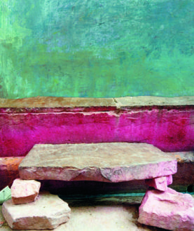
My favourite picture of nosy people: leaving a village in Gujarat
Copyright © Pauline van Lynden 2012
But with all this, the books I produce are hybrid too because, even if the scope of a subject seemed limited at first, in the end it has grown unexpected layers of meaning and the resulting book appeals to a larger diversity of readers than expected by the trade.
A standard question in publishing is about which audience a book is targeting, probably in order to position it like book sellers do, classifying titles into art, history, photography, science, ethnology, psychology, literature, and so on. The way the question is put is telling about the vision and experience of the publisher, but it requires a necessary effort of thought from an author – even if the outcome is that he or she doesn’t know (yet).
Rajasthan was my first book and I had never thought about such things. In my innocent bravura, I had the entire world in mind. It proved difficult to categorise other than as ‘a UFO’, as a surprised Parisian publisher named it, or as an ‘art book’, which surprised me even more. Three hundred collages made by hand, not using Photoshop, with added strokes of paint where texture or colour was lacking, were only meant to recreate atmospheres I had come to know well. My pages were leaving out magnificent palaces and turbans, which I considered too famous to the detriment of more mundane but equally appealing aspects of a traditional society about which the Indians themselves are not always aware that they are vanishing.
Another conscious choice was to exclude all text from the images because when you travel you do not always need to know what you’re seeing in order to appreciate it. And just when you would have thought that this true – if only because of its size – coffee-table book was purely visual, there actually is a substantial text that structures its themes into a story from city life to countryside, words which I ended up writing in English, French and Dutch for different editions.
Rajasthan touches the people who love India and those who love colour. Less foreseen perhaps is that it is particularly prized by designers. They form the main audience of Karl Lagerfeld’s intimate Librairie 7L in Paris, where the book never failed to sell since its launch in 2003. I’ve added a link to his immense personal library-cum-photostudio at the back. Mart Visser, a Duch fashion designer, told me in 2004 that Rajasthan had inspired his Spring collection that year.
A Resistible Force is probably another hybrid book. Its focus is both visual and a bit technical, its scope extremely local, definitely international, and slightly personal: 100.000 trunks of oak trees forming a grid of double rows on only twenty kilometres of Dutch coast, yet giving a fine example of a successful struggle to keep the water at bay, – with the place making my heart beat faster.
During the time of my research the sea showed its devastating face twice, first by flooding New Orleans and then with a tsunami in Asia, and the search for methods to defend the land against rising waters became a hot topic. On the Walcheren beaches today ‘only’ 100.000 wooden poles are left of many more which once lined the entire Dutch coast, and now that the shoreline of the Netherlands is artificially ‘nourished’ with sand at regular intervals the centuries-old system of ‘groynes’, as they are officially called, is considered archaic. But it appears that the Asian mangroves, in places where they were still existing, have broken the waves and protected the coast from the 2004 tsunami, and in Northern Germany the state of Mecklenburg-Vorpommern has quite recently begun to protect its Baltic Sea shore with groynes, or ‘Buhnen‘ as they say.
My initial reason to make A Resistible Force was because the view on the beach from the village of Domburg is spectacular, especially where it is lacking people… This view has inspired many artists, Piet Mondrian among them, and the long lines walking into the sea that make it so special have now become a symbol of identity through its recent promotion as endangered cultural heritage.
So, next to the necessity to include historical and technical material, my book would also be interwoven with personal impressions and an extensive ‘photographic essay’. Not an easy recipe for most publishers, as I would soon realise.
At which point it was suggested that I set up a foundation to organise the publication of my book myself. This meant a serious organisation and sounded like a challenge to an unknown side of me. To make a story short, a wise notary advised me to think about a name in order to define my targets, I found my board members and an administrator generous with his time, and Visual Legacy was born.
One year later A Resistible Force left the printing presses in two separate language editions and a special edition for the sponsors. The exercise has meant a lot of long days but a good amount of freedom and satisfaction as well. And even if the international distribution is still complicated, how rewarding it was to find this book with five other titles under ‘Nature and Landscape’ in the 2008 select catalogue of ‘7L’.


